Client: KAJO Jewels
Role: Logo Redesign and Brand Identity
Creative Direction: Aleksandra Kotowska
Photography: AK and Various Photographers
Year: 2019

introduction

KAJO Jewels is an online jewelry store that focuses on timeless, everyday pieces with some collections that relate to the newest fashion trends.  In the new branding design process, I set out to solve the tas below within 2 months. The results were amazing

my role

I led the logo design and branding concept and execution phase of this project from end to end. I collaborated with 3 photographers (Julia Klyukach, Julia Lament and Paulina Stępniak) during the early ideation stage and the lead product manager (Adam) throughout the entire project.

problem

the old logo was outdated

The initial logo was quickly designed right before brands’ launch and has not gone through a redesign for 1,5 years. The typography and kerning could be improved while preserving the initial idea for the letter “O” to look like a sun – the word “kajo” means “glow” in finnish. 

there was no brand guidelines

Brand book was 3 pages long and consisted mostly of logo variations and basic colour charts. Since the launch brands’ image and language was clarified and needed to be transformed into a set of guidelines.

the colour palette wasn't coherent

Colours used in previous photoshoots did not match the aesthetics that ruled the leading communication channel which was brand’s Instagram account. There was no clear colour-hierarchy set up which led to visual chaos. 

goal

communicate KAJO's value proposition

To give clearer messaging through branding design and visual communication. Throughout the first months the brand passed the experimentation phase and was ready for a visual rearrangement. 

connect all platforms

To draw a line between all the platforms incl. e-commerce main page, product launch landing pages, social media, newsletter and printed materials.

give KAJO a modern touch

To create a branding that will look fresh, hip, feminine but in a minimalist way. Also to ensure the logo and colours will be timeless and will work for digital and print use (including in tiny scale eg. for jewellery branding). 

early ideation

research phase

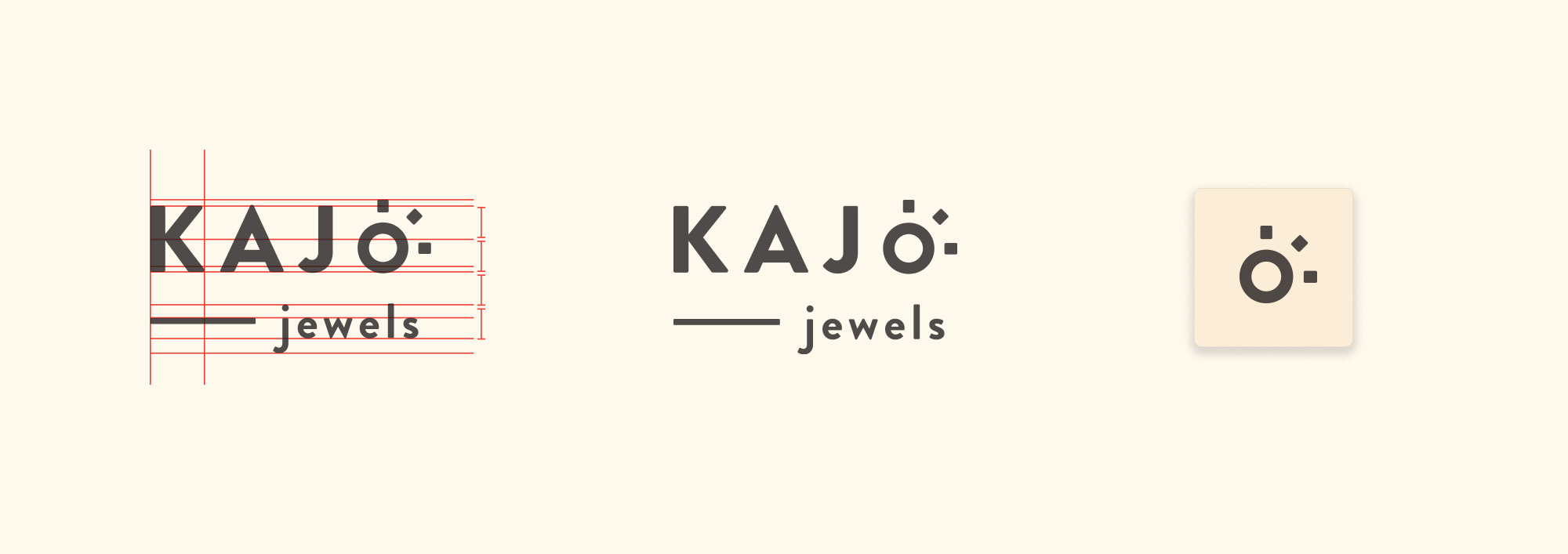
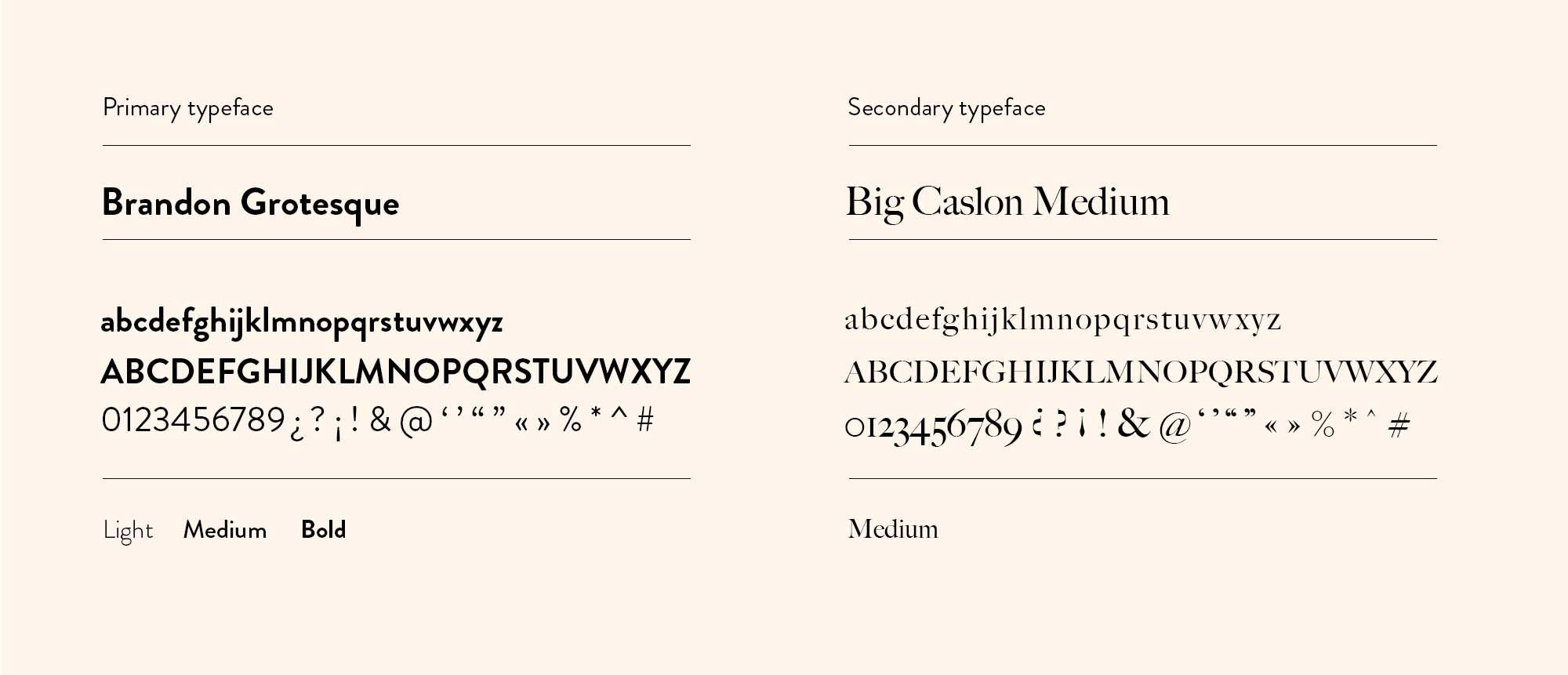
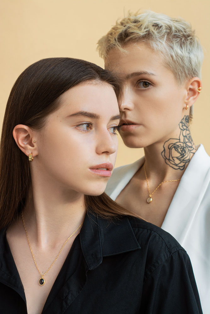
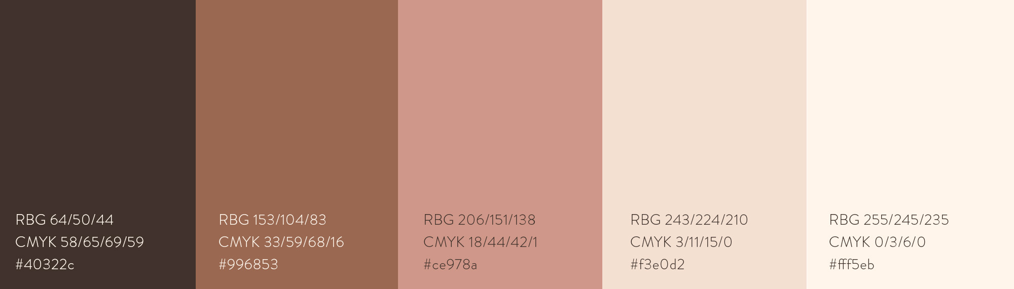
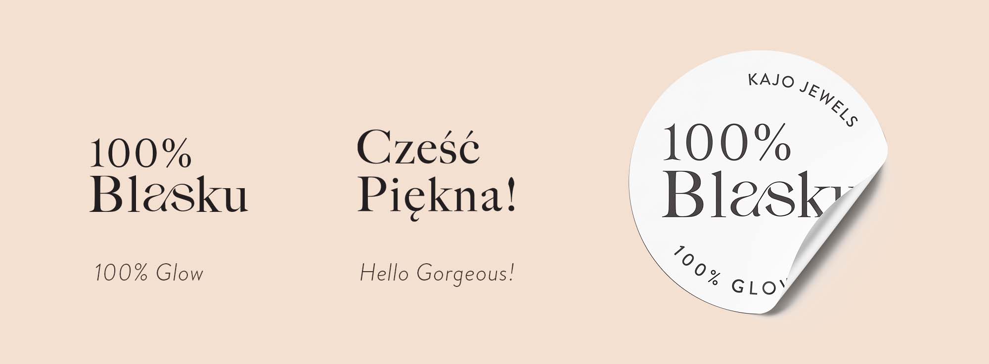
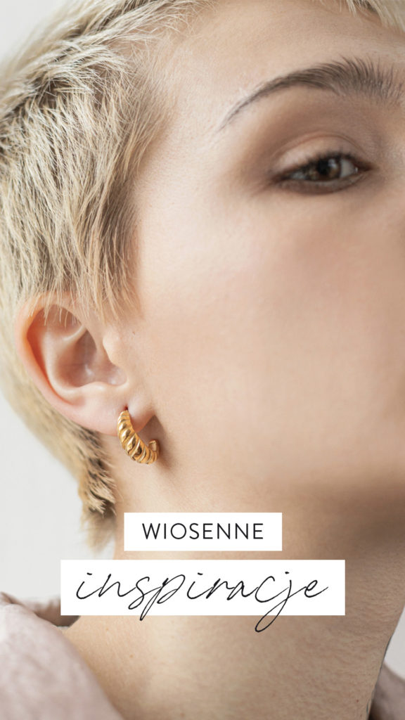
We kicked off a design sprint together with the lead Product Manager.

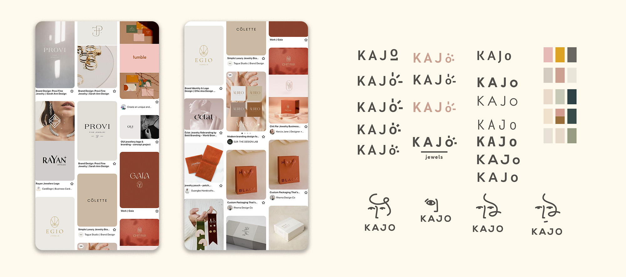
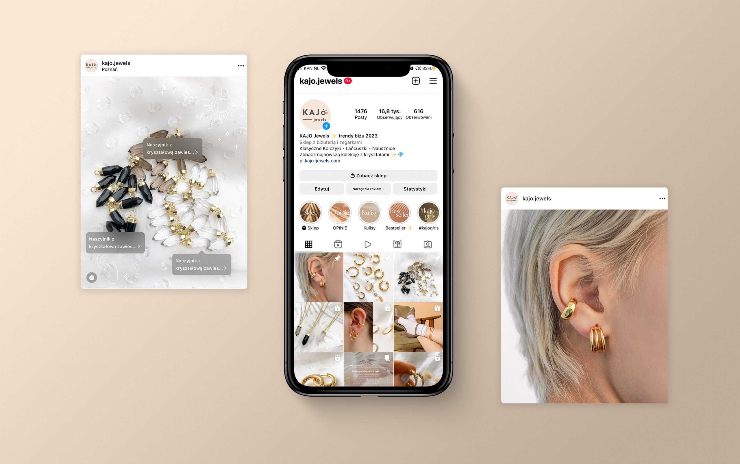
Using Pinterest and Notion as a remote collaboration tools, we gathered inspiration of how other forward-thinking jewellery/fashion brands craft their branding, and shared what we like about them.

inital sketches

I started sketching all the crazy ideas on my minds. My main focus at this stage is to diverge first, converge later.

further steps

I then turned these early ideas into high fidelity designs. Together with the team we discussed different shapes, layouts, text placements. I continued to refine these designs – chosen ones are marked with pink asterisks.

typography and colours

I was looking for an elegant combination of serif- and non-serif fonts that will work well for multiple text sizes and throughout digital and print. 

BROWSE MORE WORK